01
From browsing to choosing
Make recipes easier to navigate through cooking time, dietary preferences and sauce selection.


A collaborative course project / SAPO
A familiar sauce.
A new place at the table.
01 / The opportunity
The brief brought rebranding and website redesign together. Our direction connected ORCO's heritage with a practical question for younger home cooks: what can I make with this?
Make recipes easier to navigate through cooking time, dietary preferences and sauce selection.
Show products in the context of everyday dishes, with approachable preparation steps.
Give the brand's ingredients, people and archive a clearer place in the experience.
Design opportunities synthesised in the initial pitch, pp. 3–5 and 8–9. These are the team's framing, not quantified findings from a documented user study.
Two concepts were presented. ORCO selected Concept 1: ORCO Kitchen for further development. This case follows that direction, from the first pitch to the team's later interface designs.
02 / A familiar brand, reimagined
The proposed language pairs food photography with loose, hand-drawn marks. The intention is an approachable kitchen: useful, recognisable and a little playful.
 Existing identity
 Team proposal
The brand name and familiar character remain the anchor. Around them, the team explored a more informal visual voice. These identity assets are team work, not presented as my individual logo design.
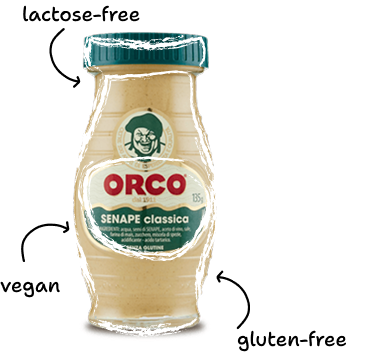
A recognisable visual gesture
Loose outlines connect food and product without replacing the photography. They suggest a note made in the kitchen, rather than a polished advertising label.
Team palette and visual language, pitch p. 7. Harmattan and Shantell Sans belong to the proposed brand system; this case keeps Be Water's reading typography.
03 / From appetite to action
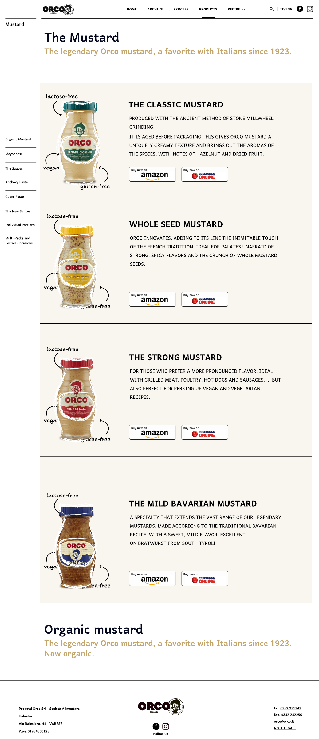
The experience connects inspiration, selection and preparation. Recipes provide a reason to explore the sauces; products lead back to something a person could cook.
The website / Four connected pages
01 / 04Team design / 01
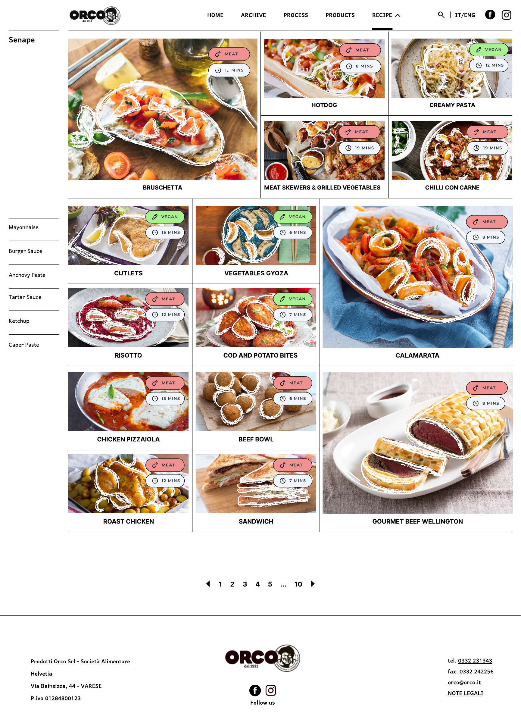
The homepage moves from a dish to cooking, ingredients, products and recipes. This is the complete supplied page, not a reconstructed live website.
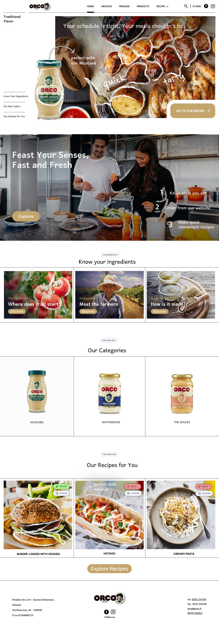
The proposed time and dietary labels support scanning; the companion product keeps the sauce connected to the meal. Before implementation, these labels need a content audit: the supplied Bruschetta screen uses a “MEAT” tag despite its listed ingredients. The original design is preserved here, not treated as verified recipe guidance.
04 / Keeping the story alive
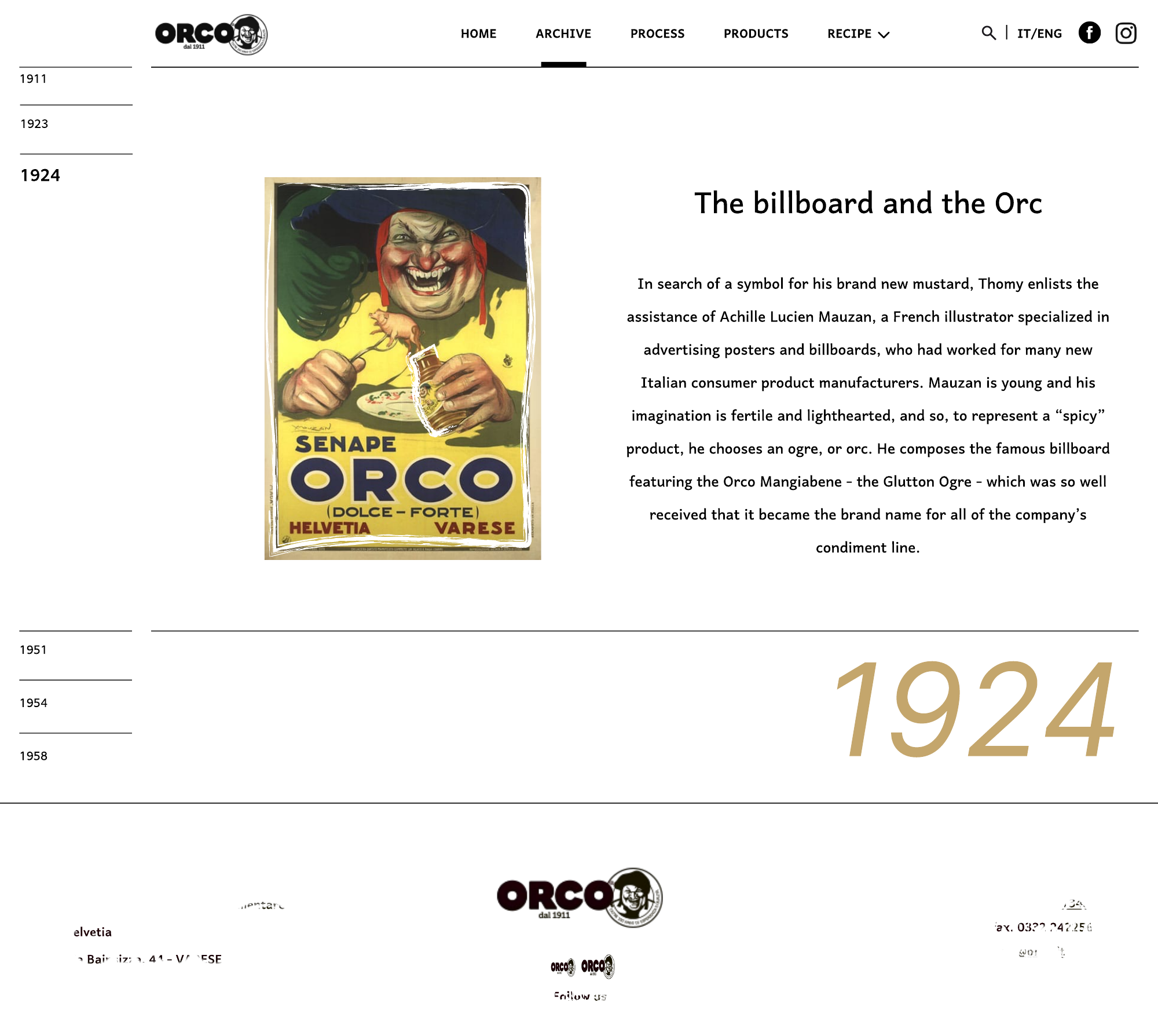
The later screen set includes an archive: a way to make packaging, illustration and the brand's past browsable. It gives the practical recipe experience a sense of where the brand comes from.
The archive / Three moments
01 / 03Team design / 01
The proposed archive opens with the company's origins. A persistent year index gives the history a browsable structure.
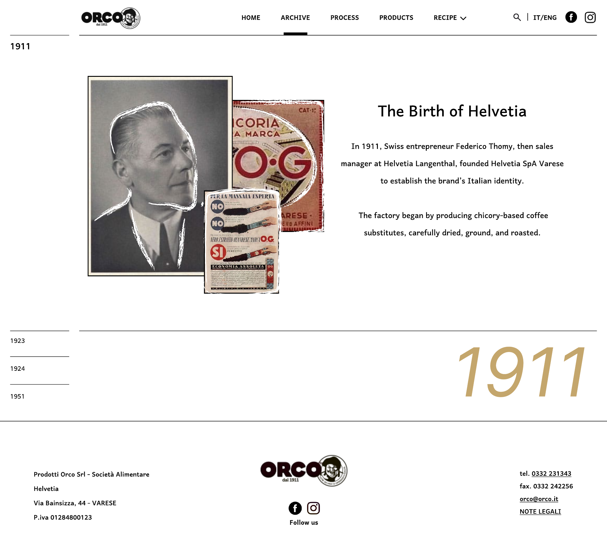
Selected original archive screen designs supplied by SAPO. Historical dates and image captions are reproduced as project material; the full archive would require editorial verification before publication.
Contribution & delivery
I contributed to research, information architecture, website UI design, and the project presentation as part of SAPO.
Frame.
Structure.
Make it tangible.
I helped frame the opportunity and organise the website's information architecture.
Opportunity framing ↗I contributed to the webpage UI and the presentation of the team's proposal.
Website designs ↗The team developed the selected direction into a clickable prototype. Branding and imagery shown here are attributed to the team.
The brand expressed an intention to use the direction and connect it with a development team. Subsequent adoption, development and launch are unconfirmed. No conversion, usability or business-impact results are claimed.
The initial 23-page “Evolving ORCO” pitch and supplied SAPO screen folder are the available records. The final pitch deck and a shareable prototype link were not supplied. Selection and delivery status are based on the creator's account.
The deck proposes video guidance, transparency and community features; the available materials do not establish that all of these were implemented. Photography rights, historical copy, dietary labels, responsive exports and accessibility would need review before public release.